8 Reasons Laravel is Ideal for Your Next Web Project

Are you considering revamping your website and are unsure about which framework to use? Look no further than Laravel. With over 1,886,397 websites worldwide built using Laravel, it has established itself as a powerhouse in the web development arena (Builtwith, 2024). Let’s delve into why Laravel should be your top choice for your next web project.

1. Familiarity and Simplicity

Laravel’s popularity stems from its user-friendly nature. As the leading PHP framework, it boasts a vast community of developers who are well-versed in its functionalities. With a range of built-in templates, Laravel simplifies development, allowing skilled developers to create a 5 or 6-page website in just a day or two. This rapid development time translates to lower costs and faster results for businesses.

2. Robust Security Features

Security is paramount in today’s digital landscape. Laravel prioritizes security with features such as HTTP middleware, input sanitization, encryption, rate limiting, and password hashing. Regular updates ensure that your website stays fortified against threats. Its use of the Bcrypt hashing algorithm ensures that passwords are never stored in plain text, offering a robust layer of protection for sensitive data.

3. Enhanced Performance

Laravel excels in performance optimization. It supports caching out-of-the-box, boosting site speed significantly. Additionally, techniques like memory use reduction and database indexing are seamlessly integrated, making Laravel an ideal choice for businesses prioritizing site speed and SEO friendliness.

4. Scalability for Growing Businesses

As your business expands, Laravel’s scalability becomes invaluable. Its unique message queue system enables efficient handling of website requests, ensuring smooth performance even under heavy traffic loads. This scalability not only maintains server health but also minimizes long-term hosting costs.

5. Flexibility and Versatility

Laravel’s versatility extends to its ability to create diverse web applications, from professional B2B websites to complex eCommerce platforms. Its extensive authorization libraries and third-party packages facilitate the integration of advanced features like encryption and password reset. Compatible with various operating systems, Laravel is a go-to choice for cross-platform web applications.

6. Seamless Third-Party Integrations

Integrating third-party applications is seamless with Laravel’s clean APIs. Whether you need a payment system like Stripe or an automated marketing tool, Laravel simplifies the integration process, ensuring smooth functionality across your website.

7. Easy Maintenance and Future-Proofing

Maintaining a Laravel site is straightforward, thanks to its clean code, MVC architecture, and adherence to OOP principles. This ensures that future developers can easily understand and modify the codebase, making ongoing maintenance hassle-free.

8. Cost-Effectiveness

Laravel’s open-source nature eliminates licensing costs, making it an affordable choice for web projects. Development costs are further reduced due to its rapid development capabilities and ease of maintenance, making Laravel a cost-effective solution in the long run.

In conclusion, Laravel stands out as the premier choice for Web development projects due to its blend of simplicity, security, performance, scalability, versatility, integration capabilities, easy maintenance, and cost-effectiveness. Whether you’re a seasoned developer or looking to hire a Laravel development company, embracing Laravel ensures a robust and successful web project.

Why Laravel is the Best PHP Framework

PHP powers a significant portion of the web, with 76.4% of websites using it, according to w3techs. Among PHP frameworks, Laravel stands out as a top choice for web development due to its robust features, developer-friendly approach, and strong ecosystem.

What is Laravel?

Laravel is a leading PHP framework known for its elegant syntax, extensive features, and scalability. It simplifies web application development with expressive code and a modular architecture. Let’s explore why Laravel is considered the best PHP framework.

1. Model-View-Controller (MVC) Architecture

At the heart of Laravel’s success is its adherence to the Model-View-Controller (MVC) architectural pattern. This pattern provides a structured approach to building web applications, separating the application’s logic (Model), presentation (View), and user input handling (Controller). By following the MVC pattern, Laravel promotes code organization, scalability, and maintainability.

The MVC architecture in Laravel enables developers to focus on specific components of their applications without mixing concerns. Models represent the data and business logic, Views handle the presentation layer, and Controllers manage user interactions and application flow. This separation of concerns streamlines development, improves code readability, and enhances collaboration among team members.

2. Command-Line Interface (CLI)

Laravel’s Artisan CLI (command-line interface) is a powerful tool that simplifies development tasks and enhances productivity. Developers can use Artisan commands to perform a wide range of tasks, including database migrations, generating boilerplate code, running tests, and managing application assets.

The CLI’s automation capabilities reduce manual effort and streamline repetitive tasks, allowing developers to focus on writing high-quality code. Artisan commands are easy to use and customize, making Laravel a developer-friendly framework for building complex web applications efficiently.

3. Blade Templating Engine

Laravel’s Blade templating engine is renowned for its simplicity and flexibility in creating dynamic and reusable views. Blade templates use intuitive syntax and provide features like template inheritance, control structures, and component-based design.

With Blade, developers can create elegant and responsive user interfaces without sacrificing code readability. Blade templates promote code reusability, reduce redundancy, and enhance the overall development experience. This makes Laravel an excellent choice for building modern and visually appealing web applications.

4. Eloquent ORM and Database Management

Laravel’s Eloquent ORM (Object-Relational Mapping) simplifies database interactions by providing a fluent and expressive interface. Eloquent allows developers to define database relationships, perform CRUD operations, and retrieve data using intuitive syntax.

The ORM abstracts away complex SQL queries, making database management more accessible and efficient. Eloquent’s active record implementation facilitates seamless integration with databases like PostgreSQL and MySQL, ensuring compatibility and performance optimization.

5. Security Features

Security is a top priority in Laravel, and the framework offers robust features to protect against common web vulnerabilities. Laravel’s security features include:

These security measures reduce vulnerabilities and provide a secure environment for developing web applications, making Laravel a trusted choice for businesses and developers concerned about data security.

6. Routing System

Laravel’s routing system simplifies URL routing and enhances application flexibility. Developers can define clean and expressive routes using Laravel’s intuitive syntax, improving code readability and maintenance.

Additionally, Laravel supports HTTP middleware, allowing developers to add custom logic to HTTP requests. Middleware enhances application security, optimizes performance, and enables seamless integration of third-party services, making Laravel a versatile framework for building robust web applications.

Conclusion:

Laravel’s comprehensive features, developer-friendly tools, and robust security make it the best PHP framework for modern web development. Its adherence to the MVC architecture, powerful CLI, expressive Blade templating engine, Eloquent ORM, security features, and flexible routing system set it apart as a top choice for building scalable and secure web applications.

By leveraging Laravel’s strengths, developers can create sophisticated web solutions efficiently, meet project deadlines, and deliver exceptional user experiences. Whether building simple websites or complex enterprise applications, Laravel provides the tools and ecosystem necessary for success in the ever-evolving digital landscape.

10 Unique Website Ideas for Every Niche

In today’s digital age, having a unique and engaging website is crucial for standing out in a crowded online marketplace. However, coming up with innovative website ideas that cater to your specific niche can be a daunting task. Whether you’re a small business owner, a freelancer, or an entrepreneur, having a website that reflects your brand’s uniqueness and caters to your target audience’s needs is essential for success.

Before diving into the unique website ideas, let’s first understand what we mean by “niche.”

Definition of Niche

A niche refers to a specialized segment of the market that caters to a specific group of individuals with shared interests, preferences, or needs. Niche markets often represent smaller, more focused segments within broader industries and are characterized by their distinctiveness and specificity. By targeting a niche market, businesses can tailor their products, services, and marketing efforts to better meet the needs of their target audience, resulting in higher levels of engagement, satisfaction, and loyalty.

Now, let’s explore 10 unique website ideas that can be tailored to fit any niche, helping you elevate your online presence and attract more customers.

1. Customized Landing Pages

One effective way to capture the attention of your target audience is by creating customized landing pages that speak directly to their needs and interests. Instead of using generic templates, consider designing landing pages that are tailored to specific products or services within your niche. For example, if you’re a fitness coach, you could create landing pages for different types of workouts or meal plans, each with its own unique design and messaging.

Example: Offering online fitness coach Credit: Kayla Itsines

2. Interactive Product Showcases

Give your customers a truly immersive shopping experience by incorporating interactive elements into your product showcases. This could include 360-degree product views, virtual tours, or interactive demos that allow visitors to explore your products in detail. Not only does this make for a more engaging user experience, but it also helps to build trust and credibility with your audience.

This image has an empty alt attribute; its file name is apple.png

Example: Apple Store website Credit: Apple

3. Niche-Specific Online Communities

Create a sense of belonging and community among your target audience by building niche-specific online communities on your website. This could be in the form of forums, discussion boards, or social networking features that allow users to connect with like-minded individuals and share their experiences. By fostering a sense of community, you can keep your audience engaged and coming back for more.

Example: QualityTribe, community created by Klaus Credit: Bettermode

4. Personalized Product Configurators

Give your customers the ability to customize and personalize their purchases with interactive product configurators. Whether you’re selling clothing, furniture, or customizable gifts, allowing customers to tailor their products to their preferences can help increase sales and satisfaction. By offering a unique and personalized shopping experience, you can set yourself apart from the competition and build brand loyalty.

Example: Custom Uniform for your Team by Adidas Credits: Adidas

5. Visual Storytelling Platforms

Harness the power of visual storytelling to captivate your audience and compellingly convey your brand’s message. Create multimedia content such as videos, infographics, and photo galleries that tell the story of your brand and showcase your products or services in action. By engaging your audience on a deeper level, you can forge emotional connections and leave a lasting impression.

Example: A Visual story from Stuff Credits: Shorthand

6. AI-Powered Recommendation Engines

Use artificial intelligence to personalize the user experience and recommend relevant products or content based on each visitor’s preferences and browsing history. By leveraging machine learning algorithms, you can deliver personalized recommendations that help users discover new products or content they may be interested in. This not only enhances the user experience but also increases the likelihood of conversion and repeat business.

Example Netflix Recommendation Credits: InData Labs

7. Niche-Specific Job Boards

If you’re in the business of recruiting or connecting job seekers with employers, consider creating a niche-specific job board on your website. This could be focused on a particular industry, skill set, or geographic location, making it easier for employers to find qualified candidates and for job seekers to find relevant job opportunities. By providing a targeted platform for job postings, you can become a valuable resource within your niche.

Example Dice Tech job boards Credits: Dice

8. Customized Learning Platforms

Position yourself as an authority in your niche by offering customized learning platforms that provide valuable educational content to your audience. Whether it’s through online courses, webinars, or tutorials, providing educational resources that cater to the specific needs and interests of your target audience can help establish trust and credibility. By empowering your audience with knowledge and skills, you can position yourself as a leader in your field.

Example LinkedIn Learning Credits: LinkedIn

9. Virtual Consultation Services

Offer virtual consultation services to your customers as a convenient and accessible way to provide personalized advice and support. Whether you’re a healthcare provider, financial advisor, or beauty consultant, offering virtual consultations allows you to connect with clients remotely and offer expert guidance tailored to their needs. By embracing technology and offering virtual services, you can expand your reach and attract clients from anywhere in the world.

Example Sleep Wise Consulting Credits: Sleep Wise

10. Subscription-Based Membership Sites

Create a recurring revenue stream by offering subscription-based membership sites that provide exclusive content, resources, or perks to paying members. Whether it’s premium articles, insider tips, or members-only discounts, offering valuable benefits to subscribers can incentivize them to join and remain loyal to your brand. By providing ongoing value and fostering a sense of exclusivity, you can generate predictable income and build a community of loyal supporters.

Example: Natural Cosmetics Formulation Club membership site for The School of Natural Skincare 

Credits: The School of Natural Skincare

In conclusion, these 10 unique website ideas offer creative and innovative ways to enhance your online presence and cater to the specific needs of your niche audience. Whether you’re looking to increase sales, build brand loyalty, or establish yourself as an authority in your field, incorporating these ideas into your website strategy can help you achieve your goals and stand out from the competition. So why wait? Start implementing these ideas today and take your online presence to the next level!

Dark Mode: Latest Trend in Web Development

In the fast-paced world of modern technology, web developers are constantly striving to improve the user experience and offer innovative features that keep users engaged. One such advancement that has been gaining immense popularity is Dark Mode. This trendy feature is transforming the way websites are designed and experienced, providing users with a comfortable, visually appealing, and energy-saving option.

What is Dark Mode?

Dark Mode is a design option that presents a dark background with light-colored text and interface elements. Unlike the traditional light background with dark text, Dark Mode is easier on the eyes, especially in low-light conditions. When users spend long hours staring at screens, such as on mobile devices or computers, Dark Mode can significantly reduce eye strain and fatigue. The contrast between the light text and dark background also makes it easier to read, enhancing the overall user experience.

Reasons for the Growing Popularity of Dark Mode:

1. Reduced Eye Strain

One of the primary reasons for the widespread adoption of Dark Mode is its ability to alleviate eye strain. Many individuals spend hours on their devices daily, and using Dark Mode can help reduce the discomfort caused by prolonged screen exposure.

2. Energy Efficiency

Dark Mode can significantly save energy on devices with OLED or AMOLED screens. Unlike traditional LCD screens, which use a backlight to display content, OLED and AMOLED screens can individually light up pixels. In Dark Mode, fewer pixels are illuminated, resulting in lower power consumption and extended battery life on mobile devices.

3. Improved Accessibility

Dark Mode enhances accessibility for users with visual impairments or sensitivity to light. The high contrast between light text and a dark background makes it easier for individuals with visual challenges to read and navigate through the content.

4. Modern and Stylish Look

Dark Mode gives websites a fresh and modern appearance. Many users find the dark aesthetic visually appealing, making it an excellent tool for building brands and staying competitive in the market.

Implementing Dark Mode in Web Development

For web developers looking to implement Dark Mode on their websites, the process is relatively straightforward and can be achieved with just a few lines of CSS code and JavaScript. Here’s a simple guide to get you started:

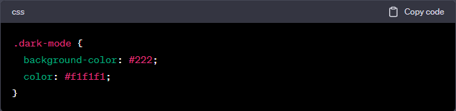
1. Create a Dark Mode CSS Class

Begin by designing a CSS class specifically for Dark Mode, specifying the styles for text and background colors. When Dark Mode is activated, this class will be applied to the elements on your website.

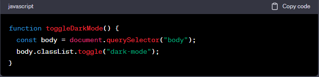
2. Use JavaScript to Toggle Dark Mode

Implement JavaScript to toggle the Dark Mode class on and off. You can achieve this by adding a toggle button on your website or detecting the user’s system preference for Dark Mode.

3. Thorough Testing

After implementing Dark Mode, thoroughly test your website on multiple browsers and devices to ensure a seamless user experience.

Conclusion

Dark Mode is undoubtedly the next big thing in web development. Its popularity stems from the benefits it offers, including reduced eye strain, better accessibility, energy savings, and a modern, stylish appearance that aligns with brand-building efforts. By adopting Dark Mode, small to medium-sized professional service businesses with seven-figure revenues can enhance their online presence and improve user satisfaction.

At Sapere Marketing, we understand the importance of staying ahead in the competitive digital landscape. Our commitment to empowering businesses with effective solutions that perfectly align with their brand and online needs extends to incorporating cutting-edge features like Dark Mode. We ensure that our partners can focus on their core tasks while we take care of their website’s maintenance, security, and optimization.

Remember, your website is the face of your business in the digital world. Embracing Dark Mode can make a significant difference in the user experience, energy efficiency, and brand representation. So, let’s take a step forward together and embrace the exciting possibilities Dark Mode offers for your business’s success!

Responsive Design: Why It Matters for Your Website

In today’s digital age, the importance of having a strong online presence cannot be overstated. Whether you’re a small business owner or a content creator, your website is often the first point of contact between you and your audience. It’s not just about having a website; it’s about having a website that can adapt to the diverse devices people use to access the internet. That’s where responsive design comes into play.

What is responsive design?

Responsive design is a web development strategy that enables your website to adjust seamlessly to various screen sizes and devices. The goal is to provide a smooth user experience, regardless of whether a person is accessing your site via a desktop computer, a tablet, or a smartphone.

Why does this matter?

1. User Experience Matters

One of the most critical aspects of responsive design is its impact on the user experience. Imagine a scenario where a potential customer tries to access your website from their smartphone, but the site isn’t optimized for mobile. Frustration sets in as they have to pinch and zoom, scroll endlessly, and struggle to find the necessary information.

This frustration can quickly drive users away, leading to high bounce rates and lost opportunities. On the contrary, a responsive design ensures that your website will look stunning and function on any device, ensuring a seamless and enjoyable experience.

Responsive design isn’t just a nice-to-have feature; it’s a fundamental component of creating a user-friendly website. Statistics support this claim. Google reported that 61% of users are unlikely to return to a mobile site they had trouble accessing, and 40% visit a competitor’s site instead.

2. Mobile-First Indexing and SEO

Google’s mobile-first indexing is another reason why responsive design is crucial. Mobile-first indexing indicates that Google primarily relies on the mobile version of your content when determining rankings and indexing websites. If your site isn’t mobile-friendly, it can negatively impact your search engine rankings.

In the ever-competitive world of SEO, ranking well on search engines is essential. Having a responsive design is one way to improve your site’s SEO performance.

3. Increased Reach and Accessibility

In an era where there’s a proliferation of devices with varying screen sizes, ensuring your website is accessible to everyone is a necessity. A responsive design extends the reach of your website to a wider audience.

Whether someone is using a massive 27-inch desktop monitor or a 5-inch smartphone, they should be able to access your website comfortably. By accommodating different devices, you’re more likely to capture and retain the attention of a broader audience.

4. Faster Loading Times

Nobody likes a slow website. In the age of instant gratification, users expect websites to load quickly. A responsive design plays a significant role in this. By optimizing the layout and content for various screen sizes, responsive websites tend to load faster.

The importance of speed extends beyond satisfying the user. Page speed is acknowledged as a ranking factor by search engines such as Google. So, a website that loads quickly not only keeps users engaged but also gets a boost in search engine rankings.

4. Cost-Effectiveness and Maintenance

Before responsive design became prevalent, some businesses resorted to creating a separate mobile version of their website. While this approach can work, it comes with added costs and complexity. You essentially need to maintain two different websites.

Responsive design, on the other hand, enables you to have one website that serves all devices. This simplifies maintenance, minimizes the likelihood of discrepancies between mobile and desktop versions, and, in the end, results in time and cost savings.

Best Practices for Responsive Design

Now that we’ve established the importance of responsive design, let’s briefly delve into some best practices for achieving it:

1. Flexible Grid Layouts: Use flexible grid layouts to ensure that your website’s elements can adjust to different screen sizes. This approach helps maintain the integrity of your site’s structure.

2. Media Queries: Media queries are your best friend in responsive design. They allow you to apply specific styles based on screen characteristics like width and height. This is how you ensure that your site looks great on various devices.

3. Optimize Images: Images can be a significant factor in page loading times. Make sure to optimize your images for the web so they load quickly without sacrificing quality. Use responsive image techniques to serve the right image size based on the user’s device.

4. Prioritize Content: Content is king, even in responsive design. Consider the order in which your content is displayed on different devices. Ensure that the most critical information is easily accessible, regardless of the screen size.

Conclusion

In a world where the internet is accessed from a myriad of devices, responsive design is no longer an option; it’s a necessity. It directly impacts the user experience, SEO, accessibility, and even your bottom line.

When your website can adapt to different screens seamlessly, you provide a better experience for your visitors, improve your search engine rankings, and reach a more extensive audience. Additionally, you save on maintenance costs and ensure that your website loads quickly.

So, if you want your website to succeed in today’s digital landscape, responsive design is not just something to consider; it’s something you need to prioritize. It’s an investment in the present and future of your online presence.