In the fast-paced digital world, small to medium-sized professional service businesses face the challenge of establishing a strong online presence while effectively managing their core responsibilities. User Interface (UI) trends play a pivotal role in this endeavor, offering innovative ways to engage audiences and improve brand experiences. Understanding these trends is vital for businesses aiming to succeed online. As we explore UI trends, we’ll see how these evolving design ideas can help businesses grow and enhance online interactions. From dynamic motion design to the appeal of dopamine-inducing color palettes, let’s dive into ways to elevate your business’s online presence.
Motion design has evolved to become an integral part of modern interface design. With advancements in animation and video compression technology, designers now have the freedom to experiment with dynamic and visually appealing motion experiences without compromising speed or efficiency. This means that businesses can create ever-immersive digital interactions that mimic the momentum and physics of physical products, enhancing user engagement.
Moreover, curated video snippets, dynamic backgrounds, and quirky video popups are set to become essential components in creating captivating brand experiences. By embracing motion design, professional service businesses can leave a lasting impression on their website visitors, strengthening their brand identity and resonating with their target audience.
Source: Slate
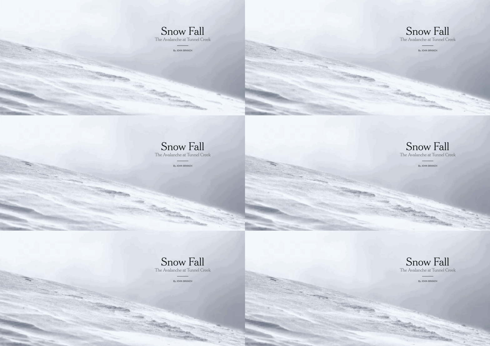
Scrollytelling, also known as immersive scrolling, is an exciting subset of motion design that holds tremendous potential for enriching the interaction between users and products. Through scroll trigger animations, businesses can transform their landing page designs into vibrant narratives, engaging users and improving brand perception.
Although scrollytelling may not directly impact a product’s utility, when executed correctly, it elevates the visual appeal and seamlessly transitions between different sets of information. This scrollytelling aspect allows businesses to breathe life into their online content despite its limited functionality. By incorporating scrollytelling in their web design, professional service businesses can create an unparalleled user experience, driving desirability and customer satisfaction.

Snow Fall: The Avalanche at Tunnel Creek
Source: The New York Times
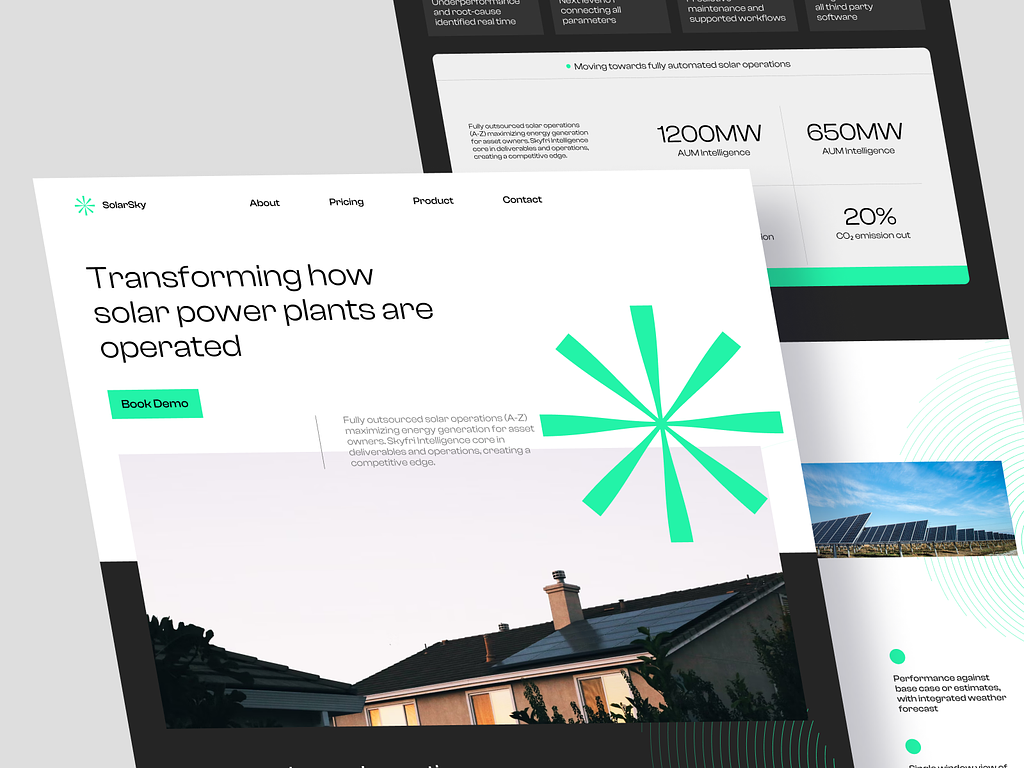
Minimalism has been a popular design approach, emphasizing functional elements, negative space, and easy navigation. However, the upcoming minimalism trend takes this concept a step further, offering a more nuanced and evolved take on simplicity.
Modern minimalism can rely on carefully curated monochromatic palettes, large flat color shapes, rounded edges, and flat graphics. This combination results in decluttered yet visually rich interfaces that maintain a soft and rounded appearance. By embracing this minimalist design with a touch of personalization, professional service businesses can create expressive and user-friendly experiences that promote clarity, readability, and easy navigation.

Solar Sky Website by Herdetya Priambodo for Plainthing Studio
Source: Dribble
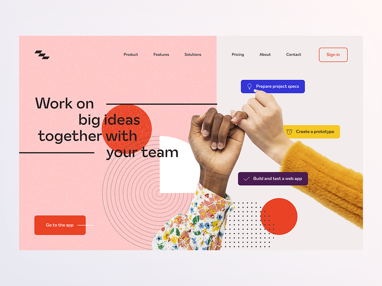
As users increasingly seek positivity and joy through their online experiences, the concept of ‘dopamine dressing’ has made its way into web design. Happy colors and bold hues, combined with retro elements, offer a powerful means of expressing brand identity and resonating with users across different age groups.
By incorporating mild textures and therapeutic hues, businesses can create web assets that exude positivity and appeal to a wide audience. Even major brands are recognizing the impact of dopamine-inducing palettes and employing them in their campaigns to stand out and make bold statements. Leveraging these vibrant colors and cheerful palettes, professional service businesses can leave a lasting impression and foster positive associations with their brand.

Project Management Landing page by Solomia Kravets for Gecko Dynamics
Source: Dribble
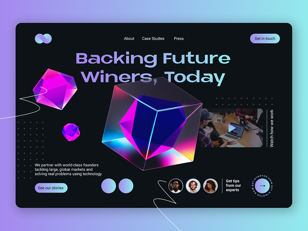
Gradients have been a consistent trend in design, and with the rise of aurora gradients, their popularity continues to soar. These ethereal color schemes blend compatible colors, offering contemporary moods while subtly referencing the nostalgia of the 80s and 90s.
The name “aurora gradients” is derived from their resemblance to the captivating Aurora Borealis. By incorporating these mesmerizing gradients in web and app designs, businesses can create elevated and smooth user experiences that exude mystique and modernity. This trend appeals to a wide range of industries, providing an opportunity for professional service businesses to infuse their web assets with a touch of magic and sophistication.

Aurora Gradients Landing by Roger Flaquer
Source: Dribble
In today’s highly competitive digital world, staying ahead means embracing the latest UI trends to enhance online experiences. By using elements like motion design, scrollytelling, bold minimalism, dopamine-inducing colors, and aurora gradients, businesses can capture audiences’ attention and push their brands forward. Sapere Marketing is here to help, offering reliable solutions while businesses focus on what they do best. With the right blend of technical expertise and creative thinking, professional service businesses can not only survive but thrive in the digital realm, securing long-lasting success in an ever-changing online world.
